Case Study: Aivia
Introduction to the project
About a year ago, Iknelia’s team became finalists in a competition organized by Tec de Monterrey, one of the top universities in Latin America and my place of work. In this contest, participants had to create a technological tool that would provide a means to improve the environmental situation. Thanks to their great effort and creativity, Iknelia’s idea was the winner. However, they lacked the technical expertise required to develop the application the way they wanted.
Problem
Shortly after the contest ended, I was lucky enough to be contacted by Iknelia to be the project developer. From the initial stage, we noticed a great difficulty: the idea of the application was too big for the short time we had - since it consisted of a set of games, courses, news, videos, challenges, social network elements, among other things - and we had only a few months to develop it.
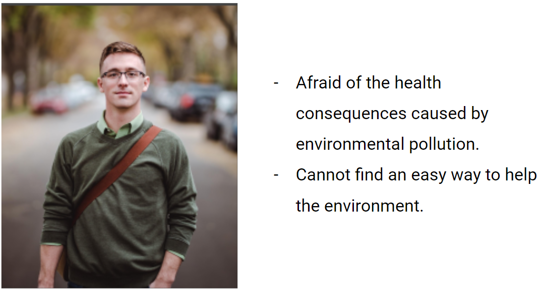
Persona Creation
Due to the large effort required to develop all of these ideas and the short period available, we decided to limit the idea to a minimum viable product: a web application for young college students to facilitate learning about environmental issues through online courses and challenges. Having defined this, the team created the Persona profile on whom we would focus all our efforts and who became our guide for the next stages. This is Santiago López Rodríguez:
Prototype design and Users research
Once we identified our users’ frustrations, I guided the team through a week-long focus on a Google Design Sprint design cycle to facilitate the flow of ideas, communication, and prototyping. I then proceeded to create the prototype using Webflow:
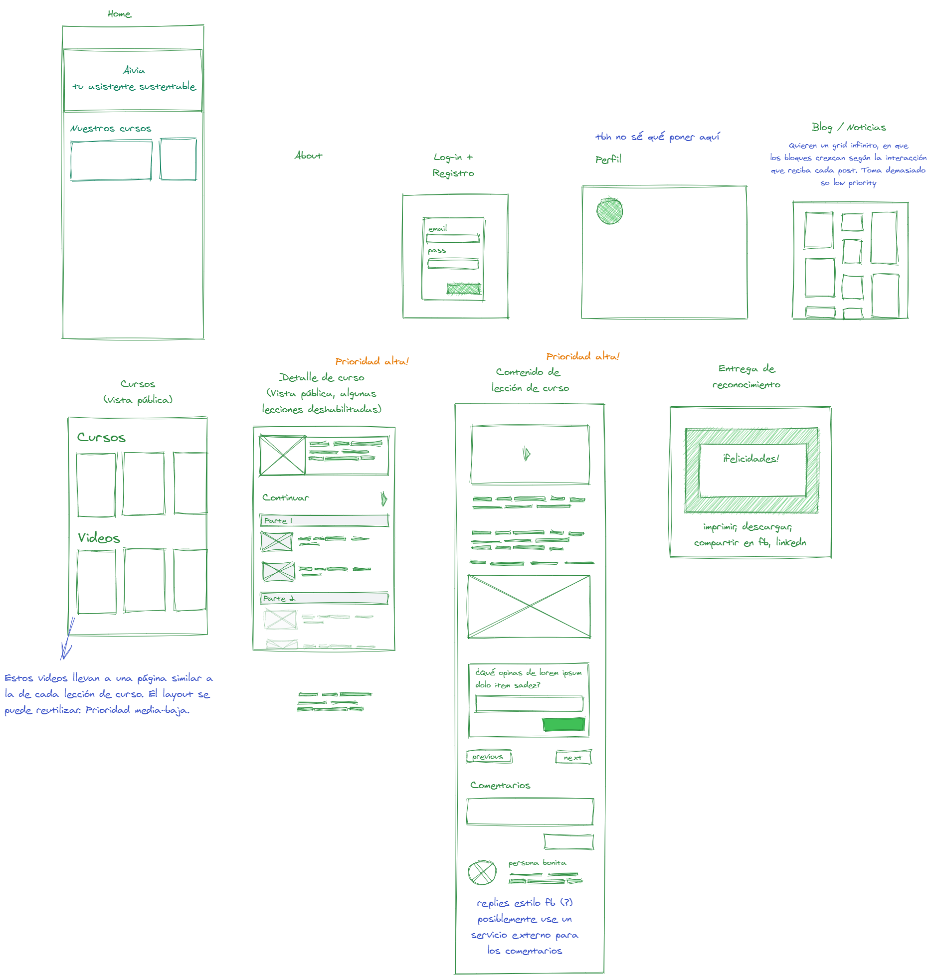
General structure of the application made by me
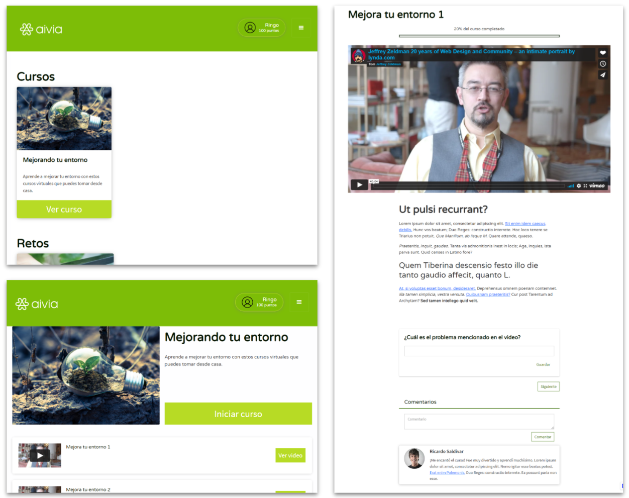
Prototype design of the main pages of the application: Catalogue page, course visualization, and lesson taking.
User interviews and tests
We used the prototype to do usability tests with a group of users similar to Santiago. From them, we gathered large amounts of information that led to small modifications in the application. However, two quotes stood out from the rest and led us to make some of the most significant changes:
- “What am I subscribing to? I don’t understand why you’re asking me to type both my name and email address” - Thanks to one interviewee mentioning this, we noticed that it was necessary to improve the transparency of information in the application and the request for personal data. This made us change the navigation to a more public structure and remove restrictions that made it necessary to create an account before accessing the list of available courses
- “Why did it take me off the page when I wanted to check a challenge? I didn’t understand what happened” - Due to one interviewee’s mention of this phrase, and the confusion reflected in some other interviewees when interacting with this same section, we decided to change the structure of this part to something that would work within the same site instead of taking the user to an external page.
Application redesign and implementation
Once the collection and analysis of data provided by the interviews were complete, I shared the prototype, comments, and the proposed structure with a designer specialized in UI design, who carried out a total redesign of the application. Once finished, we had a brief cycle of user tests which allowed us to start developing the application.
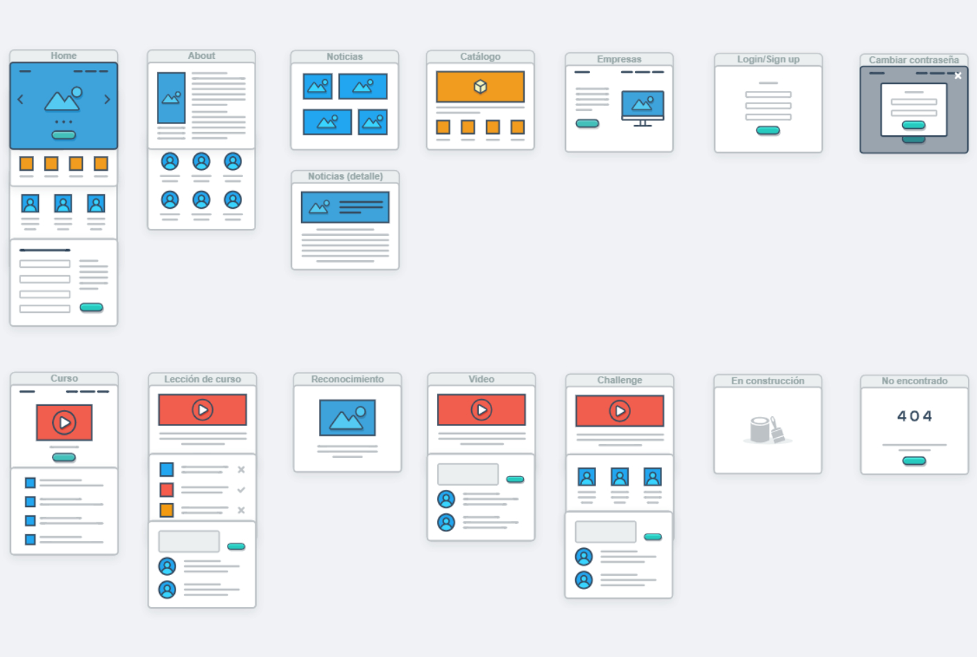
Formal mapping of screens and application sections done by me.
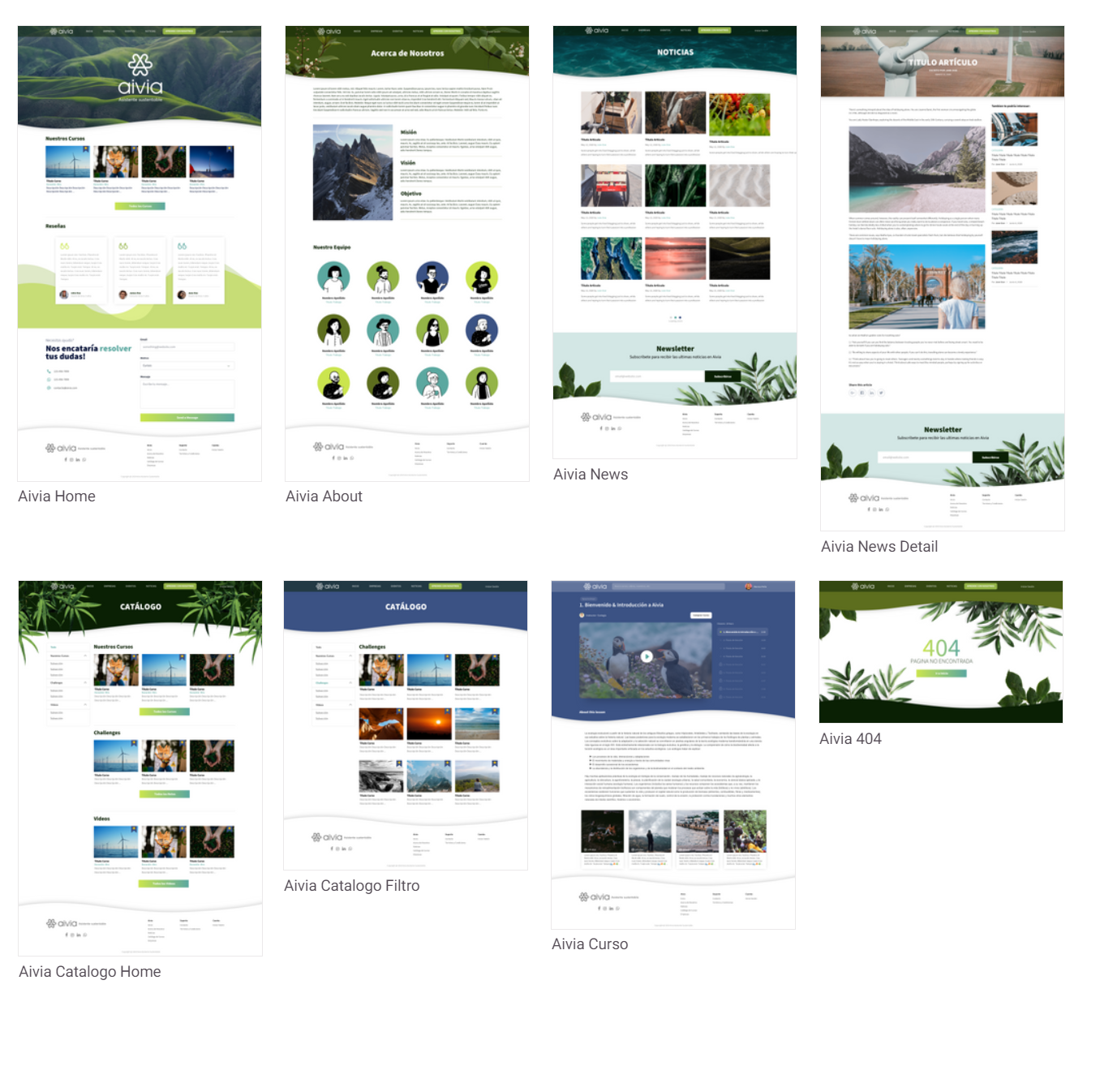
Visual redesign by UI designer
Conclusion and current status
Thanks to the team’s enormous effort and the time invested in the project, the application was recently approved to be launched to the market. Currently, it is involved in a long bureaucratic process due to the project’s starting nature; however, I will update this section in the future to include the results, comments, and any relevant details about its history.